

PermalinkIntroduction
In the ever-evolving realm of web development, most developers often focus on the functionality of their websites. They get caught up in making websites do amazing things, overlooking the foundational element that often determines a user's first and lasting impression of a website—the design. While a website's functionality is undeniably important, its visual appeal is what elevates it to a captivating online experience. In this article, we will delve deeply into the four essential pillars of web design:
Color Theory
Typography
User Interface (UI) Design
User Experience (UX) Design
These principles will help you understand the art of creating websites that not only function flawlessly but also look great and leave a joyful impression on users' hearts and minds.
Before we get into these web design principles, let's first understand the concept of good web design. Consider the website below:
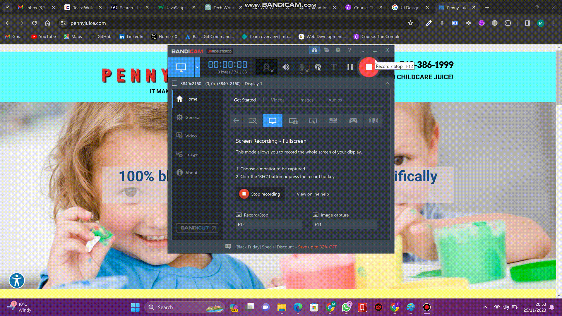
This is the website of a company called PENNYJUICE. It is one of the leading juice manufacturing companies in the United States. Observe the design of this website. Notice how the website has so many different flashy colors, making it eye-irritating. There are also too many different text colors and font styles. Also, observe how this website's components are just arranged haphazardly. It is all a bit of a mess.
Now take a look at this website:
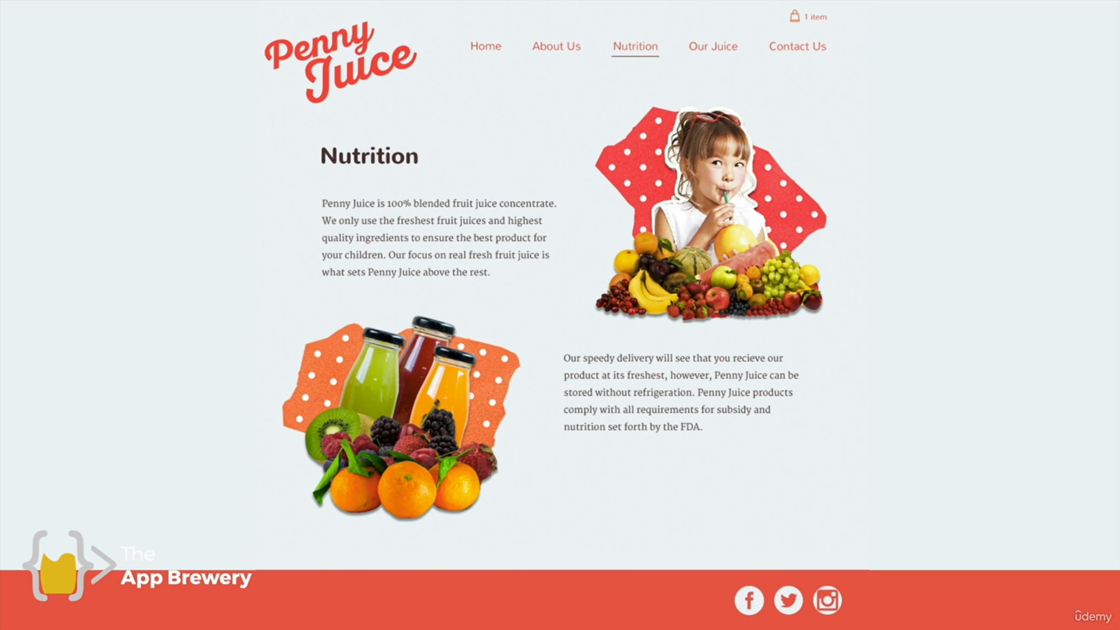
This is the same PENNYJUICE website, but it has been redesigned differently. Observe how the color scheme is now more consistent; that is, the website has a color palette of only two colors that blend well together, which are orange and brown. This color scheme is far more appealing than that of the previous design, which consisted of a mix of clashing colors that did not complement each other.
Observe also how the font style and text colors now look much better and more consistent, and how the components of the website are well arranged on the screen. This design will undoubtedly be more visually appealing to any user, and he or she will be more enthused and persuaded to purchase a product from this website than the previous one. Some users might even think the previous website is a scam just because of how badly designed it is.
Now that this example has demonstrated to you what a quality website should look like, let us explore the four primary concepts of good web design.
PermalinkColor Theory
Color Theory is the art and science of creating the right color palette for your website. A color palette is essentially a set of all the colors used on a website. It is like picking an outfit for your site. Since color is an attention-grabbing element, it is critical to understand color theory in order to create a harmonious and visually appealing website. For example, consider the first design of the PENNYJUICE website above. It has a color palette of many different flashy colors that do not blend well together, making it a visually irritating website. The second design, on the other hand, has a color palette of only two colors, orange and brown, which blend well together and make it more visually appealing.
PermalinkCreating a Color Palette
Your color palette should primarily consist of three colors: primary, secondary, and tertiary. The primary color should take up at least 60% of the website, the secondary 30%, and the tertiary 10%. This implies that you should select a primary color that is visually appealing, as the majority of the elements on your website will be in this color. There are three primary colors: red, green, and blue. You will often build websites with one of these three colors as the primary color. The tertiary color is usually a combination of the primary and secondary colors.
Before picking your primary color, you should first understand the psychological impact of colors. Each color sets a mood and conveys a message to the user.
Red signifies energy, excitement, and passion. For a website that you want to instill feelings of urgency and enthusiasm in the user, red is a perfect choice. For example, the BBC NEWS website uses red as its primary color to convey a sense of urgency, importance, and excitement since it delivers breaking news to users.
Green, on the other hand, signifies health, nature, and abundance. For example, the website of Whole Foods Market, a grocery store, is designed with green as the primary color to convey a sense of freshness, health, and natural products.
Blue conveys feelings of calmness, trust, reliability, and professionalism. For example, Facebook's website uses blue as its primary color to ensure user trust and reliability, making it an ideal choice for a social media platform. LinkedIn, a professional networking platform, also uses blue as its primary color to convey professionalism and reliability. The calming and familiar nature of blue contributes to a positive user experience.
Now that you have a better understanding of color theory and psychology, you are well-equipped to create a good color palette for your website. Before you choose your primary color, think about the feeling you want your website to give the user. Once you have decided on the primary color, ensure the secondary and tertiary colors blend well with it to create a consistent and cohesive visual identity.
PermalinkTypography
Typography is similar to selecting a suitable font and typeface for your text. It is all about presenting text in a way that makes it more enjoyable to read. A typeface is a font design that a user sees on a website; that is, a font with various styles applied to it. Let's consider the first design of the PENNYJUICE website again. Observe how the text is challenging to read due to the excessive variety of typefaces that do not complement one another. But take a look at the second design; you will see that it only uses two well-matched typefaces, which makes the text extremely readable.
There are two main font families you should know when it comes to typography: the serif and sans-serif families. Serif fonts are characterized by the presence of small decorative strokes, known as serifs, at the end of their characters. Common examples include Times New Roman, Georgia, and Baskerville. Sans-serif fonts, on the other hand, do not have these decorative strokes at the end of their characters. Examples include Arial, Helvetica, and Calibri.
Just as different colors have different moods, different fonts convey different moods and feelings to the user. Serif fonts convey a feeling of tradition, formality, and reliability. They are preferred when creating a website for something formal, such as a magazine or newspaper. Serif fonts are also useful for attention-grabbing pieces of text like headlines, titles, and subheadings.
Sans-serif fonts, on the other hand, convey a feeling of modernity, simplicity, and straightforwardness. They are extremely readable, which is why it is commonly recommended to use a sans-serif font for body text on your website or text that will be read frequently.
Always avoid using too many different fonts on your website, as this will make it visually irritating and unprofessional. It is recommended to use no more than two fonts on a single website: one serif font for headings and one sans-serif font for body text. This is not standard, and you can modify it to fit your target audience while keeping the text easy to read. Also, it is advised to use bold weights for headings to make them attention-grabbing.
PermalinkUser Interface (UI) Design
The user interface (UI) of a website is the layout, style, and functionality of its various elements. UI design is the process of creating visual interfaces that users interact with while using digital products such as websites, mobile applications, and software. It is about presenting users with the right tools to accomplish their goals. UI design is crucial to improving the overall user experience of digital products. A well-designed user interface improves an application's usability significantly.
Let's consider our PENNYJUICE website again. Based on the initial design, we can agree that a user will find it very difficult to accomplish their goal on this website, which is to buy juice. This is due to the website's components being poorly organized and styled, making it appear unprofessional and difficult to navigate. On the other hand, the second design appears much more professional, with all its components neatly arranged and styled. This makes it extremely simple for a user to navigate the site and interact with its components, potentially making it much easier to buy juice from the website.
PermalinkPrinciples of UI Design
Creating an engaging user interface requires a thorough understanding of certain design principles. Let's take a look at some of them.
Hierarchy of Information:
This principle emphasizes that you organize content on your website based on importance. Elements like headings, buttons, and important pieces of text that you want to stand out to the user should be made more visible. Use visual styles like size, color, weight, and alignment to make these elements stand out.
Let's take an example: suppose you have a section on your website where you want to write a birthday invitation message to a friend. You could write it like this:
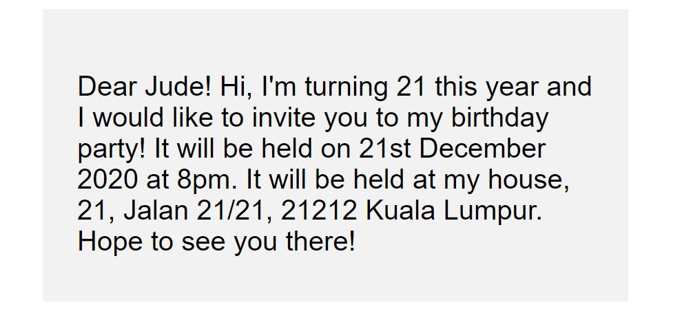
This display has a problem, though; all the text has equal weighting. If, for example, the reader wants to get important information like the date, time, and location of the birthday party, he will have to read through the entire paragraph. He cannot see the information at first glance, hence taking a longer time to get it.
However, if you apply the rules of hierarchy, you can write this same invitation like this:
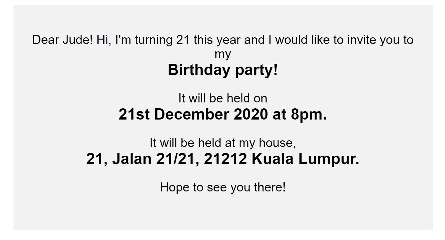
From this display, the reader can easily pick out the important information at first glance. He will not need to go through the entire paragraph again, thus taking a shorter time. Hence, it is important to establish a clear hierarchy that guides users through the interface of your website.
Layout and Responsiveness:
Layout by itself is self-explanatory. The elements of your website should be properly arranged on the screen so that your website is easy to use. To ensure your website's components are well organized, implement the following best practices:
Make sure the elements in each section of your website are aligned in the same direction. For example, suppose you have a div that contains three elements: a heading, some body text, and a button. The heading and button elements should not be centered, while the body text should be left-aligned. All three elements should be aligned in one direction to enhance the coherence of the design.
Ensure your user interface responds smoothly to various screen sizes and devices; in other words, it should always be simple to use and visually appealing, regardless of the screen size. Due to the increasing use of mobile devices, adopt a mobile-first approach when designing your layout to ensure the UI is perfectly optimized for smaller screens. Begin by designing for mobile screen sizes before progressing to larger screens.
Whitespace Utilization:
Whitespace refers to the space around your website's elements. It is a potent design element, as it enhances readability and provides visual clarity, preventing your interface from looking cluttered. An example of a website with poor whitespace usage is the IMDb website, as shown below:
As you can see from this design, there is a lot of content on the page with very little whitespace between them, resulting in a cluttered layout. This makes navigating around the website extremely challenging for first-time visitors.
On the other hand, observe the Shopify website below:
Observe how this website uses whitespace strategically to prevent visual clutter and improve readability. This demonstrates how you can use whitespace to create a balanced and well-organized layout on your website.
Navigation and Freedom:
It is difficult to appreciate a website if you cannot find your way around it, which is why navigation is critical to a good UI design. To make sure users can navigate your website with ease and feel more in control of their interactions within the application, implement the following best practices:
Your navigation bars should remain fixed at the top of the page regardless of how far the user scrolls down, allowing them to quickly access the various menus without having to scroll back up.
Use relative links when necessary to allow easy navigation between your website's pages. If your site has a lot of content, consider implementing searching and filtering to make it easier for users to find what they are looking for.
For complex or risky tasks like updating and deleting, provide guided actions such as pop-up notifications to ensure the user is absolutely certain of what he or she wants to do. This allows users to feel more in control and confident about your site.
Creating an engaging user interface requires a thorough understanding of the design principles and their best practices discussed above. A well-designed UI not only enhances the visual appeal of your website but also contributes to a positive user experience.
PermalinkUser Experience (UX) Design
User Experience (UX) is the overall feeling users get from using your website. It is all about how simple and enjoyable your website is for users to use. As a web developer, you want users to enjoy being on your website. You want them to leave as many positive reviews as possible after using your website. That's the whole point of UX.
A good user experience is typically dependent on a well-designed UI, which is why, in the case of our PENNYJUICE website, users will have a much better experience using the second design of the website than the first. To create a great UX on your website, implement the following best practices:
Simplicity:
Keep your designs simple. Avoid creating overly complex designs that will increase the cognitive load of users. Cognitive load is the mental effort that the brain uses to understand information. So, design your website's user interface to be visually appealing while remaining simple and easy to use, so that users have a low cognitive load.
Consistency:
Ensure there is consistency across your entire user interface. Use the same logo, color palette, typeface, and layout across your entire site. For example, your homepage shouldn't have a horizontal navigation bar fixed at the top, whereas your contact page should have the same navigation bar fixed vertically to the left of the screen. This will increase the cognitive load of the users because they will have to learn how to use your site twice.
Responsive Design:
Make sure your website is responsive, meaning it should look good and function properly on all screen sizes, especially mobile screen sizes because the majority of your users will be mobile users.
User Testing and Feedback:
There is no better way to improve your website's user experience than by having a real user use it and provide feedback. Conduct usability testing with real users. Get your friends to thoroughly test your website and provide feedback to help you improve it so that it is a better place for users to visit.
PermalinkConclusion
In the world of web development, it's not just about the functionality of your website; it's about making it aesthetically pleasing and effortless to use. Your website can have all sorts of cool features, but if it does not look and feel good, users will not stick around. By understanding these four fundamental principles of good web design, you can create websites that meet and surpass user expectations and entice them to return time after time.